Lesson 1: Introduction to Epidemiology
Section 6: Descriptive Epidemiology
The 5W's of descriptive epidemiology:
What = health issue of concern
Who = person
Where = place
When = time
Why/how = causes, risk factors, modes of transmission
As noted earlier, every novice newspaper reporter is taught that a story is incomplete if it does not describe the what, who, where, when, and why/how of a situation, whether it be a space shuttle launch or a house fire. Epidemiologists strive for similar comprehensiveness in characterizing an epidemiologic event, whether it be a pandemic of influenza or a local increase in all-terrain vehicle crashes. However, epidemiologists tend to use synonyms for the five W's listed above: case definition, person, place, time, and causes/risk factors/modes of transmission. Descriptive epidemiology covers time, place, and person.
Compiling and analyzing data by time, place, and person is desirable for several reasons.
- First, by looking at the data carefully, the epidemiologist becomes very familiar with the data. He or she can see what the data can or cannot reveal based on the variables available, its limitations (for example, the number of records with missing information for each important variable), and its eccentricities (for example, all cases range in age from 2 months to 6 years, plus one 17-year-old.).
- Second, the epidemiologist learns the extent and pattern of the public health problem being investigated — which months, which neighborhoods, and which groups of people have the most and least cases.
- Third, the epidemiologist creates a detailed description of the health of a population that can be easily communicated with tables, graphs, and maps.
- Fourth, the epidemiologist can identify areas or groups within the population that have high rates of disease. This information in turn provides important clues to the causes of the disease, and these clues can be turned into testable hypotheses.
Time
The occurrence of disease changes over time. Some of these changes occur regularly, while others are unpredictable. Two diseases that occur during the same season each year include influenza (winter) and West Nile virus infection (August–September). In contrast, diseases such as hepatitis B and salmonellosis can occur at any time. For diseases that occur seasonally, health officials can anticipate their occurrence and implement control and prevention measures, such as an influenza vaccination campaign or mosquito spraying. For diseases that occur sporadically, investigators can conduct studies to identify the causes and modes of spread, and then develop appropriately targeted actions to control or prevent further occurrence of the disease.
In either situation, displaying the patterns of disease occurrence by time is critical for monitoring disease occurrence in the community and for assessing whether the public health interventions made a difference.
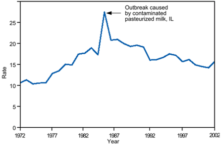
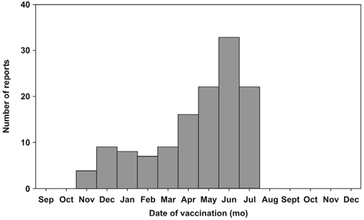
Time data are usually displayed with a two-dimensional graph. The vertical or y-axis usually shows the number or rate of cases; the horizontal or x-axis shows the time periods such as years, months, or days. The number or rate of cases is plotted over time. Graphs of disease occurrence over time are usually plotted as line graphs (Figure 1.4) or histograms (Figure 1.5).
Figure 1.4 Reported Cases of Salmonellosis per 100,000 Population, by Year — United States, 1972–2002
Source: Centers for Disease Control and Prevention. Summary of notifiable diseases–United States, 2002. Published April 30, 2004, for MMWR 2002;51(No. 53): p. 59.
Figure 1.5 Number of Intussusception Reports After the Rhesus Rotavirus Vaccine-tetravalent (RRV-TV) by Vaccination Date — United States, September 1998–December 1999
Source: Zhou W, Pool V, Iskander JK, English-Bullard R, Ball R, Wise RP, et al. In: Surveillance Summaries, January 24, 2003. MMWR 2003;52(No. SS-1):1–26.
Sometimes a graph shows the timing of events that are related to disease trends being displayed. For example, the graph may indicate the period of exposure or the date control measures were implemented. Studying a graph that notes the period of exposure may lead to insights into what may have caused illness. Studying a graph that notes the timing of control measures shows what impact, if any, the measures may have had on disease occurrence.
As noted above, time is plotted along the x-axis. Depending on the disease, the time scale may be as broad as years or decades, or as brief as days or even hours of the day. For some conditions — many chronic diseases, for example — epidemiologists tend to be interested in long-term trends or patterns in the number of cases or the rate. For other conditions, such as foodborne outbreaks, the relevant time scale is likely to be days or hours. Some of the common types of time-related graphs are further described below. These and other graphs are described in more detail in Lesson 4.
Secular (long-term) trends. Graphing the annual cases or rate of a disease over a period of years shows long-term or secular trends in the occurrence of the disease (Figure 1.4). Health officials use these graphs to assess the prevailing direction of disease occurrence (increasing, decreasing, or essentially flat), help them evaluate programs or make policy decisions, infer what caused an increase or decrease in the occurrence of a disease (particularly if the graph indicates when related events took place), and use past trends as a predictor of future incidence of disease.
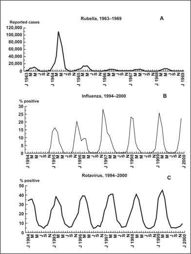
Seasonality. Disease occurrence can be graphed by week or month over the course of a year or more to show its seasonal pattern, if any. Some diseases such as influenza and West Nile infection are known to have characteristic seasonal distributions. Seasonal patterns may suggest hypotheses about how the infection is transmitted, what behavioral factors increase risk, and other possible contributors to the disease or condition. Figure 1.6 shows the seasonal patterns of rubella, influenza, and rotavirus. All three diseases display consistent seasonal distributions, but each disease peaks in different months — rubella in March to June, influenza in November to March, and rotavirus in February to April. The rubella graph is striking for the epidemic that occurred in 1963 (rubella vaccine was not available until 1969), but this epidemic nonetheless followed the seasonal pattern.
Figure 1.6 Seasonal Pattern of Rubella, Influenza and Rotavirus
Source: Dowell SF. Seasonal Variation in Host Susceptibility and Cycles of Certain Infectious Diseases. Emerg Infect Dis. 2001;5:369–74.
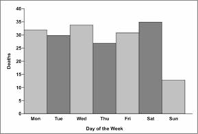
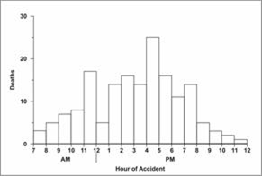
Day of week and time of day. For some conditions, displaying data by day of the week or time of day may be informative. Analysis at these shorter time periods is particularly appropriate for conditions related to occupational or environmental exposures that tend to occur at regularly scheduled intervals. In Figure 1.7, farm tractor fatalities are displayed by days of the week.(32) Note that the number of farm tractor fatalities on Sundays was about half the number on the other days. The pattern of farm tractor injuries by hour, as displayed in Figure 1.8 peaked at 11:00 a.m., dipped at noon, and peaked again at 4:00 p.m. These patterns may suggest hypotheses and possible explanations that could be evaluated with further study. Figure 1.9 shows the hourly number of survivors and rescuers presenting to local hospitals in New York following the attack on the World Trade Center on September 11, 2001.
Figure 1.8 Farm Tractor Deaths by Hour of Day
Source: Goodman RA, Smith JD, Sikes RK, Rogers DL, Mickey JL. Fatalities associated with farm tractor injuries: an epidemiologic study. Public Health Rep 1985;100:329–33.
Figure 1.9 World Trade Center Survivors and Rescuers
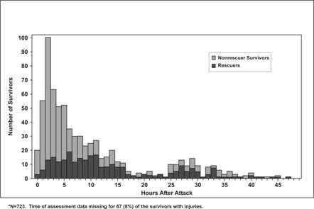
Source: Centers for Disease Control and Prevention. Rapid Assessment of Injuries Among Survivors of the Terrorist Attack on the World Trade Center — New York City, September 2001. MMWR 2002;51:1–5.
Epidemic period. To show the time course of a disease outbreak or epidemic, epidemiologists use a graph called an epidemic curve. As with the other graphs presented so far, an epidemic curve's y-axis shows the number of cases, while the x-axis shows time as either date of symptom onset or date of diagnosis. Depending on the incubation period (the length of time between exposure and onset of symptoms) and routes of transmission, the scale on the x-axis can be as broad as weeks (for a very prolonged epidemic) or as narrow as minutes (e.g., for food poisoning by chemicals that cause symptoms within minutes). Conventionally, the data are displayed as a histogram (which is similar to a bar chart but has no gaps between adjacent columns). Sometimes each case is displayed as a square, as in Figure 1.10. The shape and other features of an epidemic curve can suggest hypotheses about the time and source of exposure, the mode of transmission, and the causative agent. Epidemic curves are discussed in more detail in Lessons 4 and 6.
Figure 1.10 Cases of Salmonella Enteriditis — Chicago, February 13–21, by Date and Time of Symptom Onset
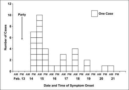
Source: Cortese M, Gerber S, Jones E, Fernandez J. A Salmonella Enteriditis outbreak in Chicago. Presented at the Eastern Regional Epidemic Intelligence Service Conference, March 23, 2000, Boston, Massachusetts.
Place
Describing the occurrence of disease by place provides insight into the geographic extent of the problem and its geographic variation. Characterization by place refers not only to place of residence but to any geographic location relevant to disease occurrence. Such locations include place of diagnosis or report, birthplace, site of employment, school district, hospital unit, or recent travel destinations. The unit may be as large as a continent or country or as small as a street address, hospital wing, or operating room. Sometimes place refers not to a specific location at all but to a place category such as urban or rural, domestic or foreign, and institutional or noninstitutional.
Consider the data in Tables 1.3 and 1.4. Table 1.3 displays SARS data by source of report, and reflects where a person with possible SARS is likely to be quarantined and treated.(33) In contrast, Table 1.4 displays the same data by where the possible SARS patients had traveled, and reflects where transmission may have occurred.
Table 1.3 Reported Cases of SARS through November 3, 2004 — United States, by Case Definition Category and State of Residence
|
Location
|
Total Cases Reported
|
Total Suspect Cases Reported
|
Total Probable Cases Reported
|
Total Confirmed Cases Reported
|
|---|---|---|---|---|
| Alaska | 1 | 1 | 0 | 0 |
| California | 29 | 22 | 5 | 2 |
| Colorado | 2 | 2 | 0 | 0 |
| Florida | 8 | 6 | 2 | 0 |
| Georgia | 3 | 3 | 0 | 0 |
| Hawaii | 1 | 1 | 0 | 0 |
| Illinois | 8 | 7 | 1 | 0 |
| Kansas | 1 | 1 | 0 | 0 |
| Kentucky | 6 | 4 | 2 | 0 |
| Maryland | 2 | 2 | 0 | 0 |
| Massachusetts | 8 | 8 | 0 | 0 |
| Minnesota | 1 | 1 | 0 | 0 |
| Mississippi | 1 | 0 | 1 | 0 |
| Missouri | 3 | 3 | 0 | 0 |
| Nevada | 3 | 3 | 0 | 0 |
| New Jersey | 2 | 1 | 0 | 1 |
| New Mexico | 1 | 0 | 0 | 1 |
| New York | 29 | 23 | 6 | 0 |
| North Carolina | 4 | 3 | 0 | 1 |
| Ohio | 2 | 2 | 0 | 0 |
| Pennsylvania | 6 | 5 | 0 | 1 |
| Rhode Island | 1 | 1 | 0 | 0 |
| South Carolina | 3 | 3 | 0 | 0 |
| Tennessee | 1 | 1 | 0 | 0 |
| Texas | 5 | 5 | 0 | 0 |
| Utah | 7 | 6 | 0 | 1 |
| Vermont | 1 | 1 | 0 | 0 |
| Virginia | 3 | 2 | 0 | 1 |
| Washington | 12 | 11 | 1 | 0 |
| West Virginia | 1 | 1 | 0 | 0 |
| Wisconsin | 2 | 1 | 1 | 0 |
| Puerto Rico | 1 | 1 | 0 | 0 |
| Total | 158 | 131 | 19 | 8 |
Adapted from: Centers for Disease Control and Prevention. Severe Acute Respiratory Syndrome (SARS) Report of Cases in the United States; Available from:http://cdc.gov/od/oc/media/presskits/sars/cases.htm.
Table 1.4 Reported Cases of SARS through November 3, 2004 — United States, by High-Risk Area Visited
|
Area
|
Count*
|
Percent
|
|---|---|---|
| Hong Kong City, China | 45 | 28 |
| Toronto, Canada | 35 | 22 |
| Guangdong Province, China | 34 | 22 |
| Beijing City, China | 25 | 16 |
| Shanghai City, China | 23 | 15 |
| Singapore | 15 | 9 |
| China, mainland | 15 | 9 |
| Taiwan | 10 | 6 |
| Anhui Province, China | 4 | 3 |
| Hanoi, Vietnam | 4 | 3 |
| Chongqing City, China | 3 | 2 |
| Guizhou Province, China | 2 | 1 |
| Macoa City, China | 2 | 1 |
| Tianjin City, China | 2 | 1 |
| Jilin Province, China | 2 | 1 |
| Xinjiang Province | 1 | 1 |
| Zhejiang Province, China | 1 | 1 |
| Guangxi Province, China | 1 | 1 |
| Shanxi Province, China | 1 | 1 |
| Liaoning Province, China | 1 | 1 |
| Hunan Province, China | 1 | 1 |
| Sichuan Province, China | 1 | 1 |
| Hubei Province, China | 1 | 1 |
| Jiangxi Province, China | 1 | 1 |
| Fujian Province, China | 1 | 1 |
| Jiangsu Province, China | 1 | 1 |
| Yunnan Province, China | 0 | 0 |
| Hebei Province, China | 0 | 0 |
| Qinghai Province, China | 0 | 0 |
| Tibet (Xizang) Province, China | 0 | 0 |
| Hainan Province | 0 | 0 |
| Henan Province, China | 0 | 0 |
| Gansu Province, China | 0 | 0 |
| Shandong Province, China | 0 | 0 |
* 158 reported case-patients visited 232 areas
Data Source: Heymann DL, Rodier G. Global Surveillance, National Surveillance, and SARS. Emerg Infect Dis. 2004;10:173–175.
Figure 1.11 Mortality Rates for Asbestosis, by State — United States, 1968–1981 and 1982–2000
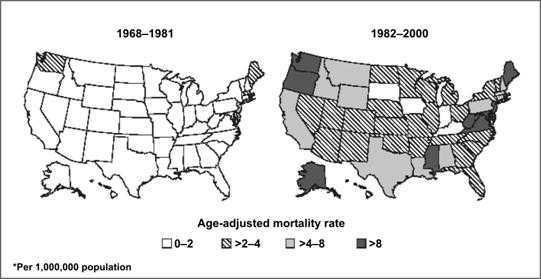
Source: Centers for Disease Control and Prevention. Changing patterns of pneumoconiosis mortality–United States, 1968–2000. MMWR 2004;53:627–32.
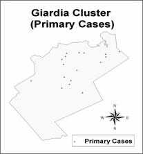
Another type of map for place data is a spot map, such as Figure 1.12. Spot maps generally are used for clusters or outbreaks with a limited number of cases. A dot or X is placed on the location that is most relevant to the disease of interest, usually where each victim lived or worked, just as John Snow did in his spot map of the Golden Square area of London (Figure 1.1). If known, sites that are relevant, such as probable locations of exposure (water pumps in Figure 1.1), are usually noted on the map.
Analyzing data by place can identify communities at increased risk of disease. Even if the data cannot reveal why these people have an increased risk, it can help generate hypotheses to test with additional studies. For example, is a community at increased risk because of characteristics of the people in the community such as genetic susceptibility, lack of immunity, risky behaviors, or exposure to local toxins or contaminated food? Can the increased risk, particularly of a communicable disease, be attributed to characteristics of the causative agent such as a particularly virulent strain, hospitable breeding sites, or availability of the vector that transmits the organism to humans? Or can the increased risk be attributed to the environment that brings the agent and the host together, such as crowding in urban areas that increases the risk of disease transmission from person to person, or more homes being built in wooded areas close to deer that carry ticks infected with the organism that causes Lyme disease? (More techniques for graphic presentation are discussed in Lesson 4.)
Person
Because personal characteristics may affect illness, organization and analysis of data by “person” may use inherent characteristics of people (for example, age, sex, race), biologic characteristics (immune status), acquired characteristics (marital status), activities (occupation, leisure activities, use of medications/tobacco/drugs), or the conditions under which they live (socioeconomic status, access to medical care). Age and sex are included in almost all data sets and are the two most commonly analyzed “person” characteristics. However, depending on the disease and the data available, analyses of other person variables are usually necessary. Usually epidemiologists begin the analysis of person data by looking at each variable separately. Sometimes, two variables such as age and sex can be examined simultaneously. Person data are usually displayed in tables or graphs.
Age. Age is probably the single most important “person” attribute, because almost every health-related event varies with age. A number of factors that also vary with age include: susceptibility, opportunity for exposure, latency or incubation period of the disease, and physiologic response (which affects, among other things, disease development).
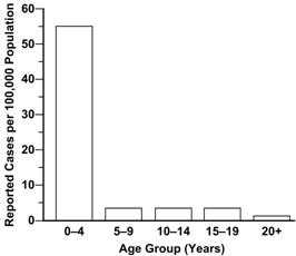
When analyzing data by age, epidemiologists try to use age groups that are narrow enough to detect any age-related patterns that may be present in the data. For some diseases, particularly chronic diseases, 10-year age groups may be adequate. For other diseases, 10-year and even 5-year age groups conceal important variations in disease occurrence by age. Consider the graph of pertussis occurrence by standard 5-year age groups shown in Figure 1.13a. The highest rate is clearly among children 4 years old and younger. But is the rate equally high in all children within that age group, or do some children have higher rates than others?
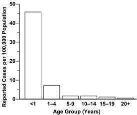
To answer this question, different age groups are needed. Examine Figure 1.13b, which shows the same data but displays the rate of pertussis for children under 1 year of age separately. Clearly, infants account for most of the high rate among 0–4 year olds. Public health efforts should thus be focused on children less than 1 year of age, rather than on the entire 5-year age group.
Sex. Males have higher rates of illness and death than do females for many diseases. For some diseases, this sex-related difference is because of genetic, hormonal, anatomic, or other inherent differences between the sexes. These inherent differences affect susceptibility or physiologic responses. For example, premenopausal women have a lower risk of heart disease than men of the same age. This difference has been attributed to higher estrogen levels in women. On the other hand, the sex-related differences in the occurrence of many diseases reflect differences in opportunity or levels of exposure. For example, Figure 1.14 shows the differences in lung cancer rates over time among men and women.(34) The difference noted in earlier years has been attributed to the higher prevalence of smoking among men in the past. Unfortunately, prevalence of smoking among women now equals that among men, and lung cancer rates in women have been climbing as a result.(35)
Figure 1.14 Lung Cancer Rates — United States, 1930–1999
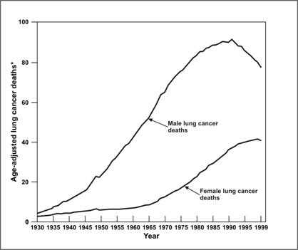
Data Source: American Cancer Society [Internet]. Atlanta: The American Cancer Society, Inc. Available from: http://cancer.org/docroot/PRO/content/PRO_1_1_ Cancer_ Statistics_2005_Presentation.asp.
Ethnic and racial groups. Sometimes epidemiologists are interested in analyzing person data by biologic, cultural or social groupings such as race, nationality, religion, or social groups such as tribes and other geographically or socially isolated groups. Differences in racial, ethnic, or other group variables may reflect differences in susceptibility or exposure, or differences in other factors that influence the risk of disease, such as socioeconomic status and access to health care. In Figure 1.15, infant mortality rates for 2002 are shown by race and Hispanic origin of the mother.
Figure 1.15 Infant Mortality Rates for 2002, by Race and Ethnicity of Mother
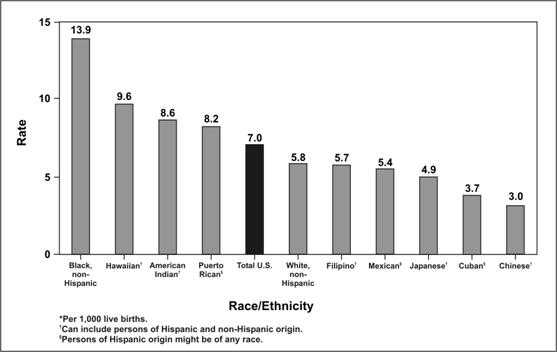
Source: Centers for Disease Control and Prevention. QuickStats: Infant mortality rates*, by selected racial/ethnic populations — United States, 2002, MMWR 2005;54(05):126.
Socioeconomic status. Socioeconomic status is difficult to quantify. It is made up of many variables such as occupation, family income, educational achievement or census track, living conditions, and social standing. The variables that are easiest to measure may not accurately reflect the overall concept. Nevertheless, epidemiologists commonly use occupation, family income, and educational achievement, while recognizing that these variables do not measure socioeconomic status precisely.
The frequency of many adverse health conditions increases with decreasing socioeconomic status. For example, tuberculosis is more common among persons in lower socioeconomic strata. Infant mortality and time lost from work due to disability are both associated with lower income. These patterns may reflect more harmful exposures, lower resistance, and less access to health care. Or they may in part reflect an interdependent relationship that is impossible to untangle: Does low socioeconomic status contribute to disability, or does disability contribute to lower socioeconomic status, or both? What accounts for the disproportionate prevalence of diabetes and asthma in lower socioeconomic areas? (36, 37)
A few adverse health conditions occur more frequently among persons of higher socioeconomic status. Gout was known as the “disease of kings” because of its association with consumption of rich foods. Other conditions associated with higher socioeconomic status include breast cancer, Kawasaki syndrome, chronic fatigue syndrome, and tennis elbow. Differences in exposure account for at least some if not most of the differences in the frequency of these conditions.
 Exercise 1.6
Using the data in Tables 1.5 and 1.6, describe the death rate patterns for the “Unusual Event.” For example, how do death rates vary between men and women overall, among the different socioeconomic classes, among men and women in different socioeconomic classes, and among adults and children in different socioeconomic classes? Can you guess what type of situation might result in such death rate patterns?
Table 1.5 Deaths and Death Rates for an Unusual Event, by Sex and Socioeconomic Status
| Socioeconomic Status | |||||
|---|---|---|---|---|---|
|
Sex
|
Measure
|
High
|
Middle
|
Low
|
Total
|
| Males | Persons at risk |
179
|
173
|
499
|
851
|
| Deaths |
120
|
148
|
441
|
709
|
|
| Death rate (%) |
67.0
|
85.5
|
88.4
|
83.3
|
|
| Females | Persons at risk |
143
|
107
|
212
|
462
|
| Deaths |
9
|
13
|
132
|
154
|
|
| Death rate (%) |
6.3
|
12.6
|
62.3
|
33.3
|
|
| Both sexes | Persons at risk |
322
|
280
|
711
|
1313
|
| Deaths |
129
|
161
|
573
|
863
|
|
| Death rate (%) |
40.1
|
57.5
|
80.6
|
65.7
|
|
Table 1.6 Deaths and Death Rates for an Unusual Event, by Age and Socioeconomic Status
| Socioeconomic Status | ||||
|---|---|---|---|---|
|
Age Group
|
Measure
|
High/Middle
|
Low
|
Total
|
| Adults | Persons at risk |
566
|
664
|
1230
|
| Deaths |
287
|
545
|
832
|
|
| Death rate (%) |
50.7
|
82.1
|
67.6
|
|
| Children | Persons at risk |
36
|
47
|
83
|
| Deaths |
3
|
28
|
31
|
|
| Death rate (%) |
8.3
|
59.6
|
37.3
|
|
| All Ages | Persons at risk |
602
|
711
|
1313
|
| Deaths |
290
|
573
|
863
|
|
| Death rate (%) |
48.2
|
80.6
|
65.7
|
|
References (This Section)
- Goodman RA, Smith JD, Sikes RK, Rogers DL, Mickey JL. Fatalities associated with farm tractor injuries: an epidemiologic study. Public Health Rep 1985;100:329–33.
- Heyman DL, Rodier G. Global surveillance, national surveillance, and SARS. Emerg Infect Dis. 2003;10:173–5.
- American Cancer Society [Internet]. Atlanta: The American Cancer Society, Inc. Available from: http://www.cancer.org/Research/CancerFactsFigures/cancer-facts-figures-2005/.
- Centers for Disease Control and Prevention. Current trends. Lung cancer and breast cancer trends among women–Texas. MMWR 1984;33(MM19):266.
- Liao Y, Tucker P, Okoro CA, Giles WH, Mokdad AH, Harris VB, et. al. REACH 2010 surveillance for health status in minority communities — United States, 2001–2002. MMWR 2004;53:1–36.
Image Description
Figure 1.4
Description: A line graph shows a dramatic peak indicating an outbreak caused by contaminated pasteurized milk in Illinois. Return to text.
Figure 1.5
Description: A histogram shows the number of reported cases of intussusception by month. Return to text.
Figure 1.6
Description: Three line graphs show a comparison of the number of reported cases of rubella, influenza, and rotavirus by month and year comparing frequency, duration, and severity of each. Return to text.
Figure 1.7
Description: Histogram shows comparison of the number of tractor deaths by day of the week. Differences by day are easily seen. Return to text.
Figure 1.8
Description: Histogram shows comparison of the number of tractor deaths by hour. Differences by hour are easily seen. Return to text.
Figure 1.9
Description: A histogram with different colored bars indicating the number of World Trade Center nonrescuer survivors and rescuers treated in hospitals. A dramatic increase and decrease in the number survivors compared to rescuers within a few hours after the attack can be seen. Return to text.
Figure 1.10
Description: Histogram shows each case represented by a square stacked into columns. The number of cases by date and time after a party is seen. Return to text.
Figure 1.11
Description: Two rate distribution maps show an increase in age-adjusted mortality rate for asbestosis in almost all states over time. Return to text.
Figure 1.12
Description: A map shows the geographic location of primary cases. Return to text.
Figure 1.13a
Description: Bar chart shows pertussis cases in age groups of 4 year intervals. The majority of cases occur in children aged 0-4 years. Return to text.
Figure 1.13b
Description: Bar chart shows the same data as Figure 1.13a displayed with different age groups. The majority of pertussis cases occur in children younger than 1 year of age. Return to text.
Figure 1.14
Description: Line graph with 2 lines shows more lung cancer deaths in men than in women. Lung cancer deaths in men is higher than for women but has been decreasing slightly since the early 1990s. Return to text.
Figure 1.15
Description: Bar chart shows infant mortality rates by race/ethnicity as separate bars. Differences in race and ethnicity are easily seen. Return to text.
- Page last reviewed: May 18, 2012
- Page last updated: May 18, 2012
- Content source:


 ShareCompartir
